Have you ever looked at a layout that you created only to realize that you don't like it? This happened to me this past week. I made a layout and there were things about it that bothered me! LOL. It was missing a bit of "me", if that makes any sense. So I pulled it apart and fixed it up!
Below is the finished version that I am happy with...
And below is the original layout that drove me nuts! I have an issue with symmetry. I prefer balanced, asymmetrical layouts.
I used Pion Design's new collection, Grandma's School Book. Click HERE to view the entire collection.
I used one of Mistra's sketches for inspiration. The final version of my layout is much more similar to the sketch.
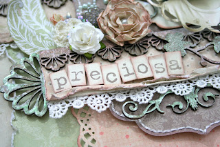
I made the large flower by using Mistra's English Rose Tutorial. You can download the tutorial HERE.
This embossed image was stamped using Vilda Stamps V18 Flowerswirl.
These cute letters were cut from one of the Pion papers! Their cut out sheets make it so simple to add embellishments to a layout.
This inked and embossed chipboard element was cut from the Dusty Attic chippy, Flourish #8 DA0702. All of the Dusty Attic chipboard on this layout can be purchased from my SHOP.
The feathers were stamped with Vilda Stamp V336 Easter Rice & Feather. It was then embossed and fussy cut to create this embellishment.
Father's Day Celebration Contest
Leave comment here about post and on Facebook tell us your best advice you ever got from your father.
Comment both places for more chances to win a
Comment both places for more chances to win a
Check out the great deals on the
@
Check back with us daily and leave comments every time for a better chance to win.
Winner will be announced on Sunday, June 17.
(Only one winner)


WOW! What a wonderful layout Natasha! No wonder you're one of my favorite designers! :) Such beautiful details and wonderful layering, and what a cutie of a daughter! :)
ReplyDelete